
Some FaB classes are easy to picture and some aren’t. This piece is about a hunch I had: that the classes hardest to describe are also the hardest to tell apart by their art, and that the two are connected. To test it I used an image-embedding model, a tool that turns each artwork into a set of numbers so similarity can be measured. Nothing was generated or altered; the existing art was only compared to itself. This article is not the place to look for advice on how to win more games.
When I first approached Flesh and Blood, I was presented with the available classes. Among others: Ninja, Warrior, Wizard, Brute and… Guardian? I had some difficulties imagining what characterized them. I immediately associated Guardians with what in online games are called tanks: characters that absorb lots of damage to help the team push through. But this is a 1v1 game.
After getting to know the cards, I eventually concluded that Guardians were just Warriors with more muscles and big hammers, characterized by a rather mono-attack playstyle.
Then Superslam was released.
I remember not being too enthusiastic about it since it contained none of my favourite classes, but I still played through the prerelease. Between boos and cheers, I picked up more than a couple of Guardian cards and found myself asking people:
“Why isn’t this a Warrior card?”
My mates dismissed my claims, stating that it was just another way to complain about the set. And, to be fair, they may have had a point. But then I started noticing more examples.
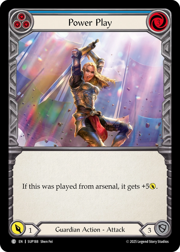
Take Power Play. It shows a woman in armor wielding a sword. It would be rather awkward to put this artwork on a Mechanologist or Wizard card, but it doesn’t seem particularly strange to imagine it on a Warrior.
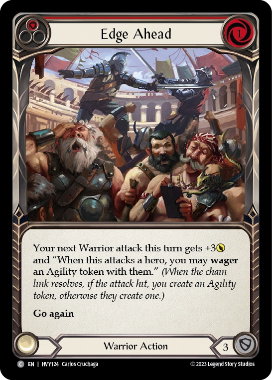
The same logic can be applied in the other direction with cards like Edge Ahead. Big muscles? Must be a Guardian.
And apparently I wasn’t the only one confused about class identities.
When I introduced the game to my girlfriend – who is a bit less obsessive about details than me, except when it comes to cleaning the house – she asked me why Illusionists weren’t also Wizards.
My only answer at the time was: “Well, they are Wizards specialized in creating illusions.”
Not exactly a very convincing explanation.
If some of these classes are difficult to conceptualize, perhaps they are also difficult to distinguish visually. So I decided to test it.
Putting card art on a map
Modern machine-learning models can turn images into numerical representations called embeddings. The basic idea is that images that look similar should end up with similar numerical representations, while visually different images should end up further apart. Imagine a map where distance means “looks alike” rather than physical distance. I wondered what would happen if I applied this to FaB.
I collected the artwork from every card and cropped it so that only the art remained – not by hand, of course. I then used an embedding model to turn every piece of artwork into a point in a high-dimensional “style space”. We can project this space down to two dimensions and visualize where every card lands.
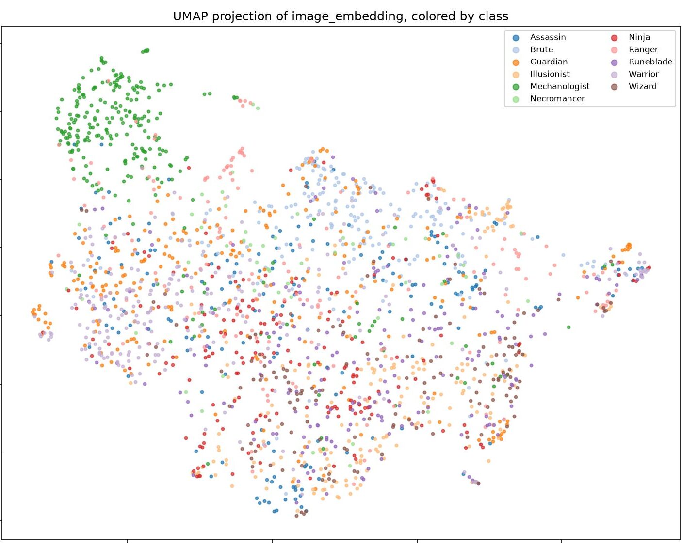
Every dot is a card, and cards that look more alike should generally end up closer together.
But before looking at the results of my analyses, I made the map interactive AT THIS LINK.
So here’s a challenge: hovering over the dots of the interactive map, can you find the groups containing swords, motorbikes, bows, dragons, angels and horses? And once you’ve found those, see if you can spot some other groups yourself. What I find particularly interesting is that the map is not simply organizing cards by class. It also seems to capture recurring visual elements that cut across classes.
Once you’re done playing, we can see what happens when we quantify the similarities.
Which classes look like each other?
For every card, I found its 15 nearest neighbours: the fifteen pieces of artwork that look most similar to it, regardless of their official class. I then asked: of those fifteen neighbours, what fraction belongs to each class? Averaging this over all cards in a class gives us a breakdown of what that class’s artwork tends to be confused with.
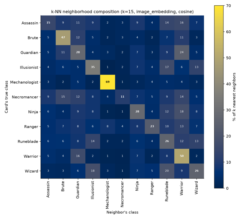
The diagonal of the resulting matrix gives us an interesting measure of visual distinctiveness. If a class’s nearest neighbours mostly belong to the same class, its artwork has a strong visual identity. If its nearest neighbours frequently belong to other classes, it is harder to distinguish visually.
Mechanologist is the clear standout, with 69% of its nearest neighbours belonging to the same class. Necromancer sits at the other extreme, at just 11%. This is probably not too surprising: their allies look like Brutes, Warriors and Guardians, just a little more decomposed.
But then we get to the result I was looking for: Warriors and Guardians are the two classes that get confused with each other the most.
And the relationship is asymmetric in an interesting way. Warriors are more visually distinctive than Guardians, while Guardian cards are often just as likely to have a Warrior card among their nearest-looking neighbours as another Guardian card. So apparently I wasn’t completely making this up – at least according to a machine-learning model.
But is this really the closest pair?
To check this from another angle, I also applied a hierarchical clustering algorithm to the classes. Instead of looking at individual cards, this time I calculated the average position of each class in the style space and grouped the classes according to how close they were. In the plot below, the shortest the line connecting 2 classes, the more similar they are.
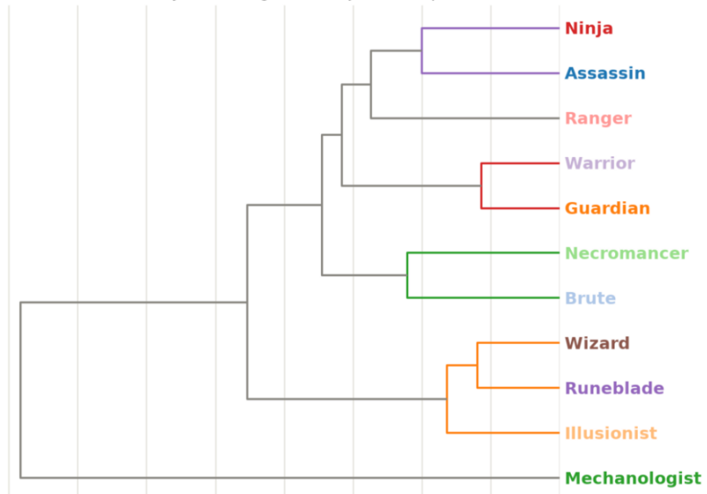
The closest pair is indeed Warrior and Guardian. Next we find Wizard and Runeblade, with Illusionist sitting nearby. A little further away are Assassin and Ninja, while Ranger is close but somewhat more distinctive. And once again, Mechanologist sits by itself.
Conclusion
You may be used to me publishing analyses of the competitive FaB meta, but it’s summer and I am on vacation. Competitive FaB, or anything cognitively demanding for that matter, is the last thing on my mind, so I thought having fun analyzing the art could be a nice project to tackle while waiting for the sun to become less intense before going to the beach.
We are all focused on winning in this game, where competition dominates. But I feel like on average less time is spent on the beauty of the art that accompanies it and which makes it so appealing. Imagine playing the same game but with blank cards. No thanks.
For this reason, when developing a new set, design teams put a lot of time and dedication into making the individual cards stand out and represent their classes in the best possible way. The artists then express their own creativity through the commissioned pieces.
And yet, as we have seen, some classes are much easier to distinguish visually than others. Mechanologists have a visual identity that is almost impossible to confuse with anything else. Warriors and Guardians, on the other hand, share so much visual territory that they are the closest pair in the entire game. Wizards, Runeblades and Illusionists form another close group, while Assassins and Ninjas also seem to inhabit a similar visual world.
I don’t want to say that cards like Power Play have the wrong art. On the contrary, the artwork is great. What I find interesting is that the conceptual ambiguity of some classes seems to be reflected in the card art itself. What resolves this ambiguity is their unique playstyle, which the game masterfully conveys.
A Guardian doesn’t need to look completely different from a Warrior for us to know what a Guardian is once we play the game. The artwork gives us an impression of the class, while the cards and the way they play complete the picture.
So perhaps my original description wasn’t entirely wrong after all.
Guardians are Warriors with hammers.
And Illusionists?
Specialized Wizards.
Appendix
I have also extracted some of the individual cards whose artwork is particularly close to another class. Here are a few of my favourites:
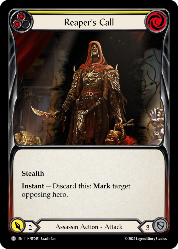
Reaper’s Call = confused with Warrior: short sword + armor + Kassai’s hood
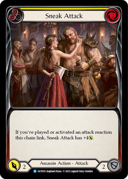
Sneak Attack = Warrior: well, there’s an axe and what look like warriors
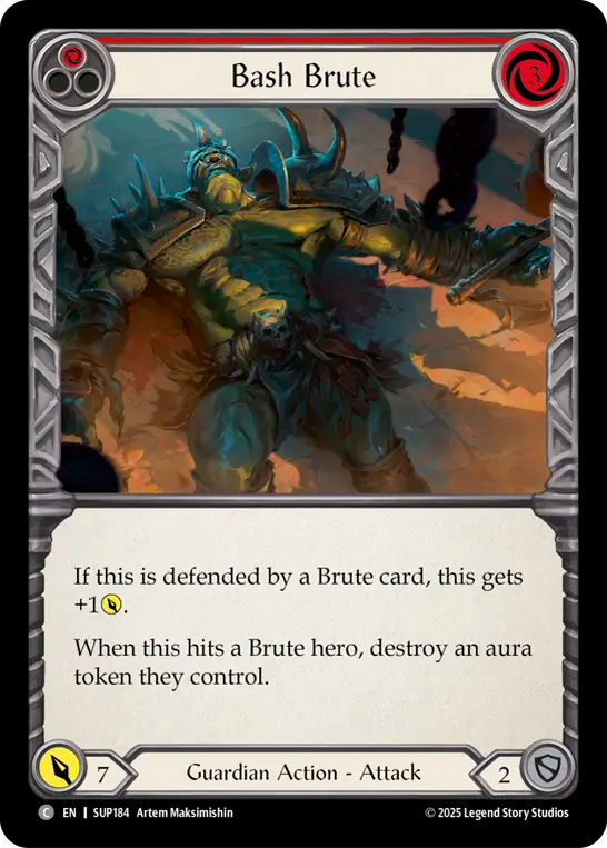
Bash Brute = Brute: self-explanatory
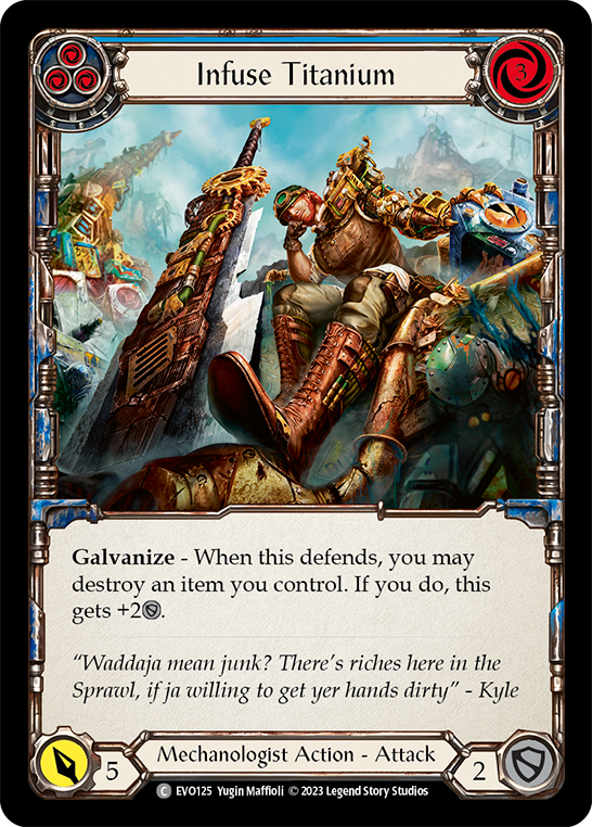
Infuse Titanium = Guardian: a dude in armor + a big @ss sword
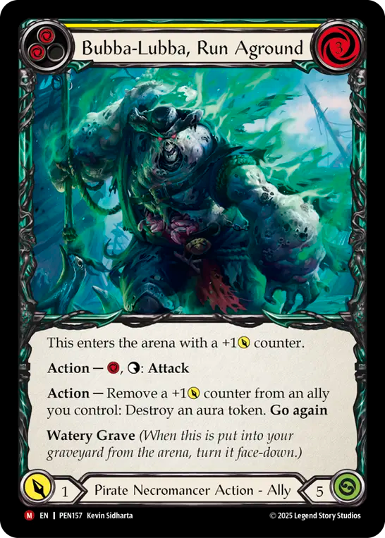
Bubba Lubba = Brute: must be an undead Brute
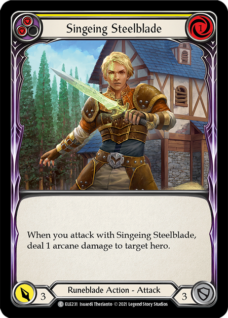
Dead Threads = Illusionist: those skeletons aren’t real, right?
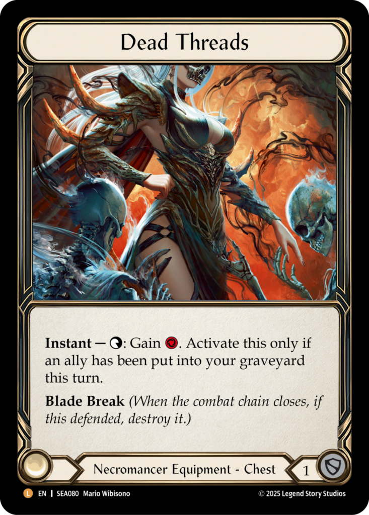
Skullbone Crosswrap = Mechanologist: too much tech
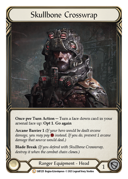
Riptide = Brute: this is how brutes are born
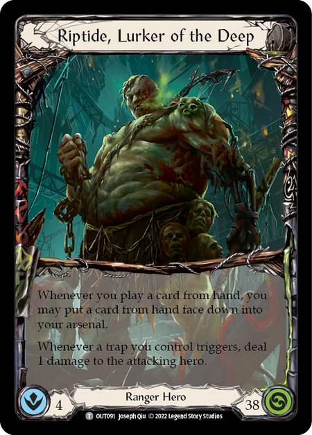
Singeing Steelblade = Warrior: sword not shiny and purple enough for Runeblade
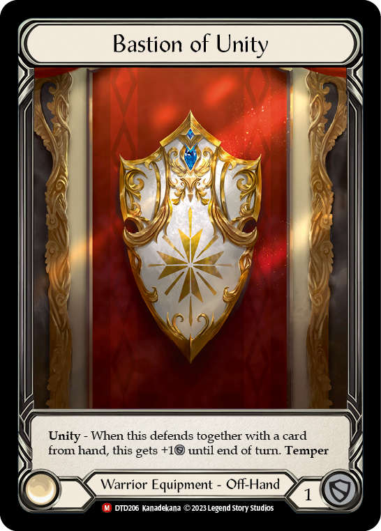
Bastion of Unity = Guardian: aren’t shields for Guardians?
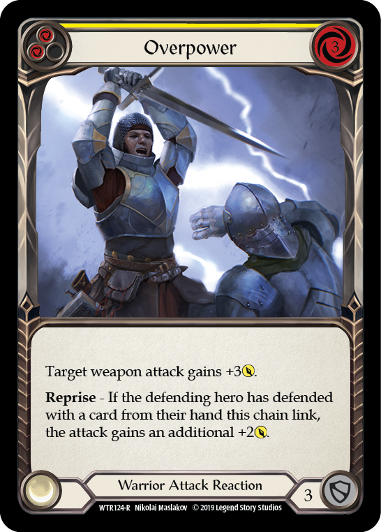
Overpower = Guardian: even more armor than Power Play
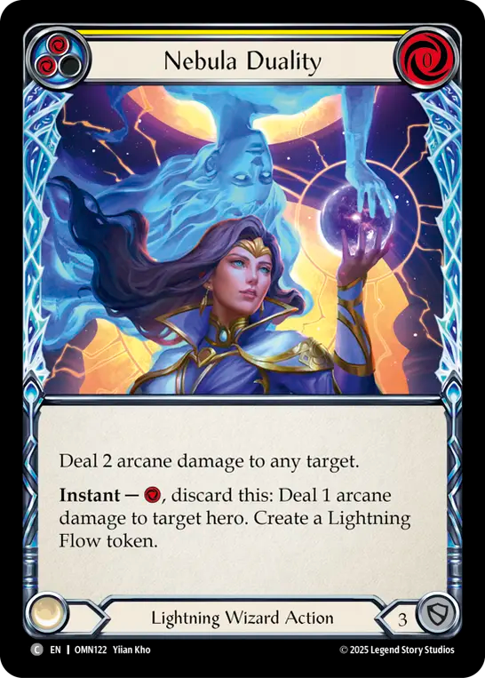
Nebula Duality = Illusionist: the mirror image looks like an illusion to me…
Appendix 2
I decided to have a bit more fun, this time using Generic card arts and looking at the neighbors they look most similar to. Here are my favs:
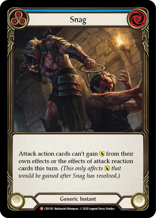
Snag -> Assassin
Command and Conquer -> Assassin (this one is hard even for me to guess why. maybe the amount of red?)
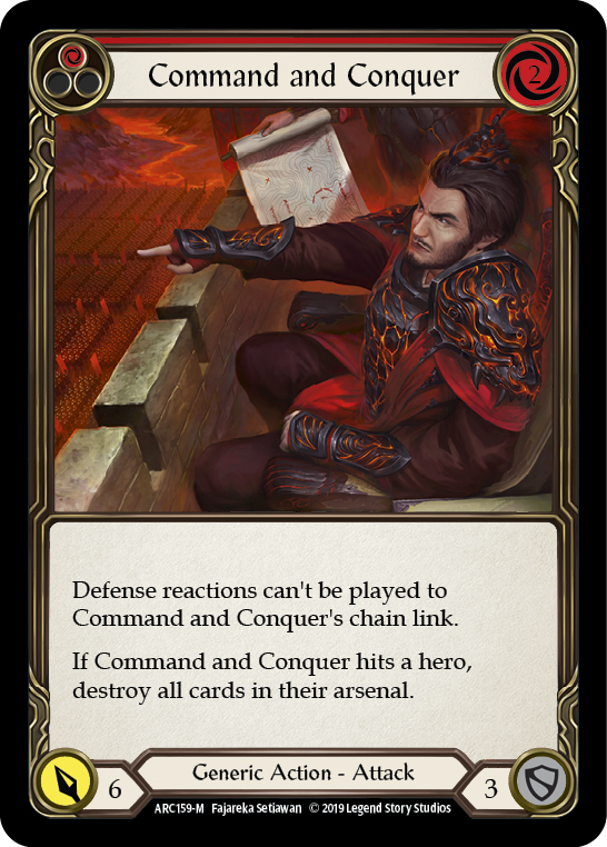
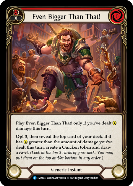
Even Bigger than That -> Guardian
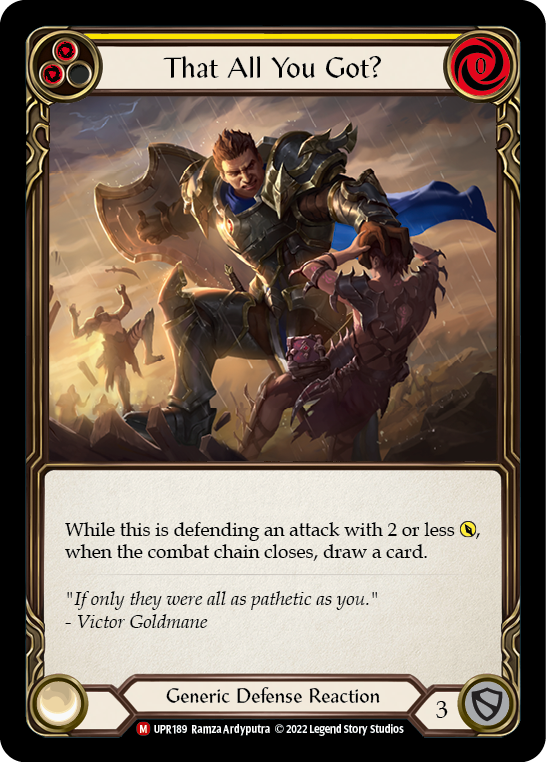
That All You Got? -> Guardian (well the shield is there and he’s big…)
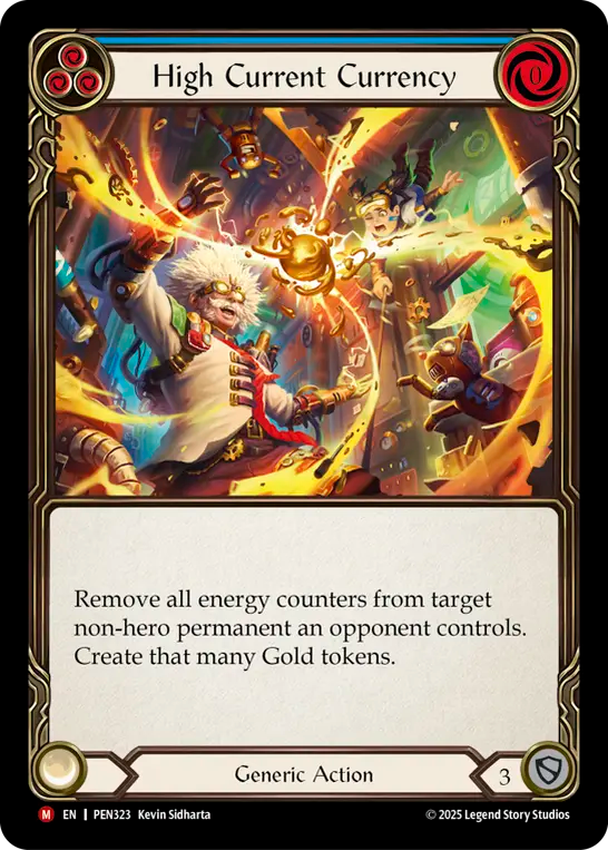
High Current Currency -> Mechanologist
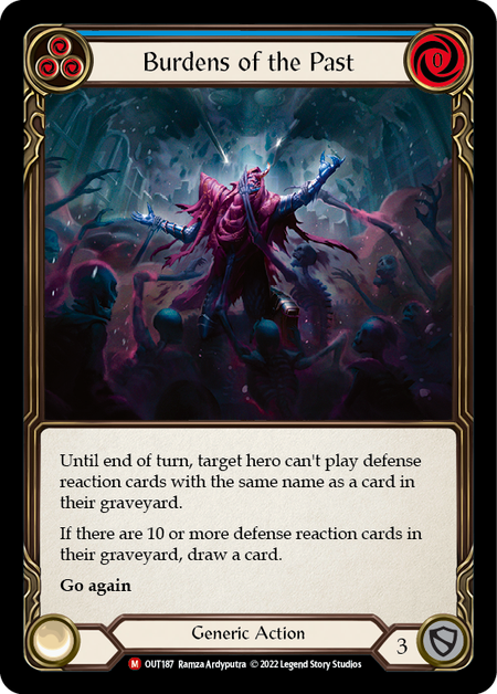
Burdens of the Past -> Necromancer
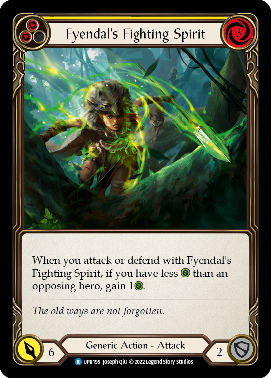
Fyendal’s Fighting Spirit -> Ranger
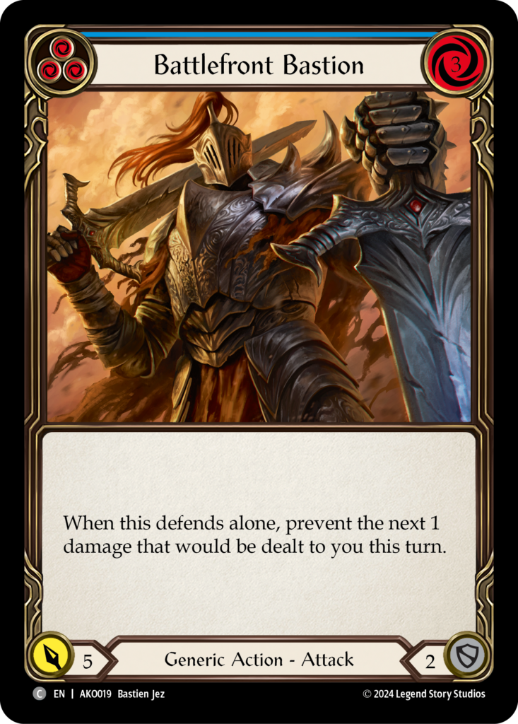
Battlefront Bastion -> Warrior
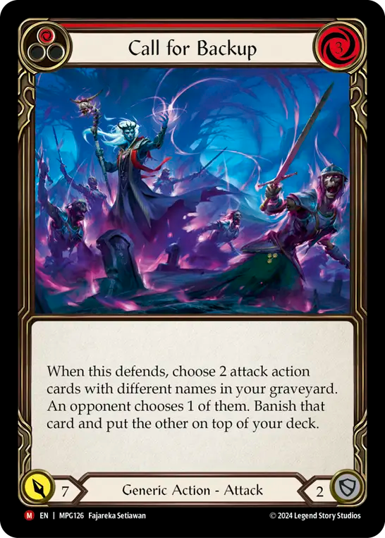
Call for Backup -> Wizard (maybe Necro = specialized Wizards)
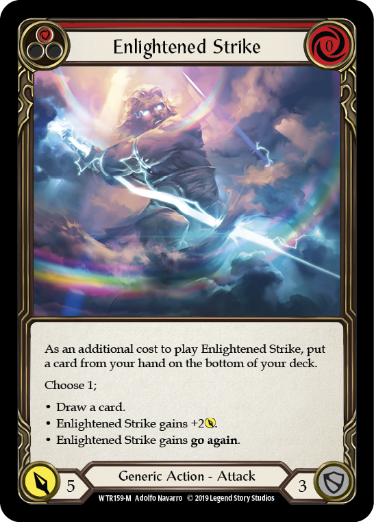
Enlightened Strike -> Wizard